


Review Part 2: Configuring Google Tag Manager
Why Power BI?
Power BI is an application from Microsoft that allows you to easily create data visualizations from almost any data source. It’s similar in many ways to Tableau. Some of the major benefits include:
- Lots of built-in connectors to popular data platforms (Google Analytics, Adobe Analytics, Marketo, Facebook, etc.)
- Publish to the cloud
- If connected to a data source, data is updated automatically
- Simple drag and drop interface
- Build your own queries
Building the Power BI dashboard
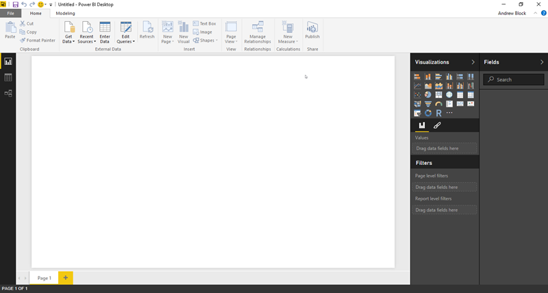
The basic UI of Power BI looks like this. We’ll be starting with a very simple dashboard, in hopes that you will continue to add to it! Download and install Power BI Desktop if you have not already. Please note that you can build reports in Power BI Online, but I prefer desktop. Online doesn’t have all the capabilities of the desktop application.
Getting your Google Analytics data into Power BI
Getting your Google Analytics data into Power BI is a breeze. Here’s the data we’re going to grab:
- The scroll tracking dimensions and metrics we created in Part 2
- Device type (mobile, tablet, desktop)
- Source/medium, which gives us insight into where visitors are coming from
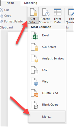
In the Power BI main menu, make sure you’re on the Home tab, and then click Get Data, then More.
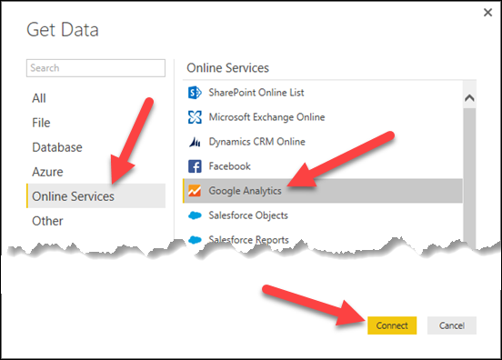
Click Online Services, Google Analytics, and then click the Connect button.
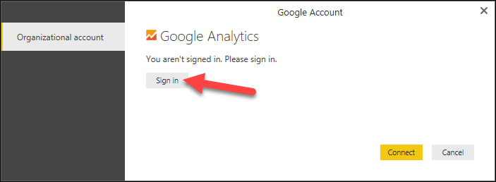
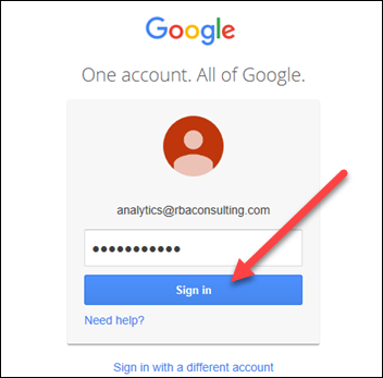
On this next screen, click Sign In.
Enter your Google credentials and then click Sign In.
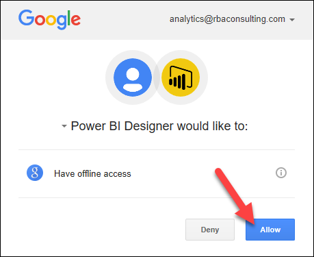
Give Power BI the permissions it requests by clicking Allow.
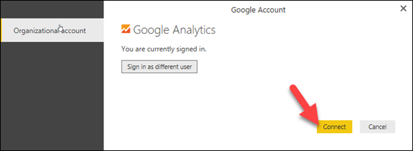
Now you’re signed in to Google Analytics. Go ahead and click the Connect button.
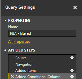
Now we’re going to grab the specific dimensions and metrics we need to build out our dashboard. First, navigate to the correct Web property and view. In my case, I am looking for a view called “RBA – filtered.” (Remember from part 2, Google Analytics is organized around accounts, properties, and views).
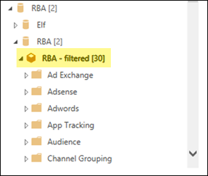
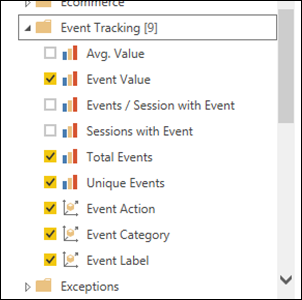
Expand the Event Tracking folder, and then check the following metrics and dimensions:
- Event Value
- Total Events
- Unique Events
- Event Action
- Event Category
- Event Label
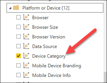
Expand Platform or Device, and then choose Device Category.
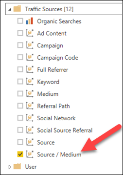
Finally, under Traffic Sources, click Source / Medium.
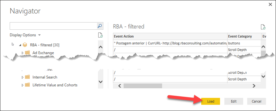
Finally, after making all these selections, click the Load button.
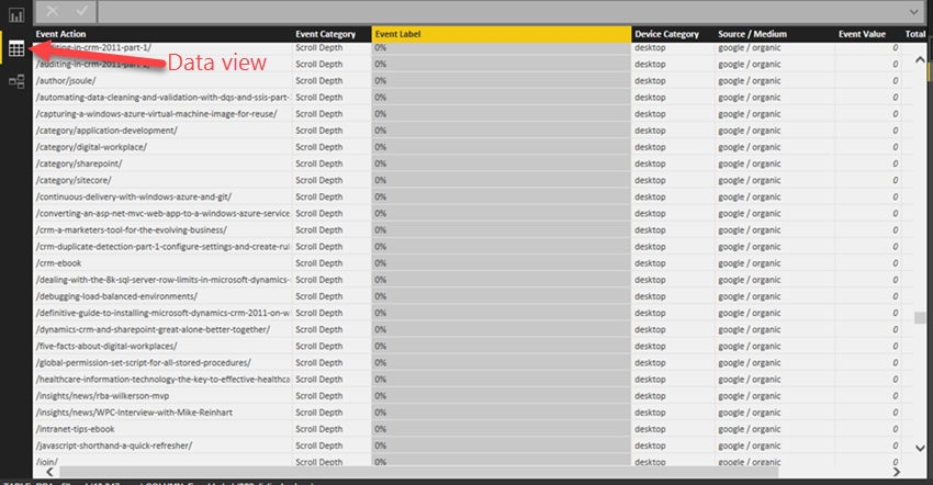
OK, we’ve loaded the necessary data points. It will appear as if nothing has happened yet, but if you click the data icon, you’ll see that Power BI has loaded your data into a table. The cool thing here is that the connection to Google Analytics is maintained, so new data from Analytics will continue to flow into Power BI.
Now would also be a good time to save your Power BI file. Click File, Save, and give it a name and save it somewhere.
Cleaning up the data
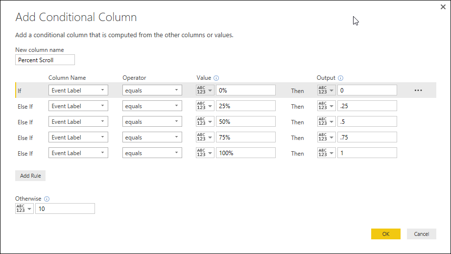
Before we create our data visualizations, we need to do some data cleanup. First off, most of us have multiple events in our Google Analytics properties. This creates some problems with the sorting of the scroll percentages, since the data in the column is mixed and difficult to sort (numbers, percentages, and text). I’ve found the best way to tackle this problem is to create a conditional column that transforms everything into a percentage.
In the main menu bar, click “Edit Queries.” The Query Editor allows us to transform and manipulate data to our hearts’ content.
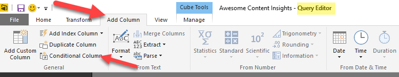
Once in the Query Editor, click the Add Column tab, then click Conditional Column.
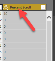
Name your column Percent Scroll and use the following conditions:
- If Event Label = 0% Then 0
- If Event Label = 25% Then .25
- If Event Label = 50% Then .5
- If Event Label = 75% Then .75
- If Event Label = 100% Then 1
- Otherwise 10
- Click OK
Note: Everything in the query editor is applied as a step. You can edit and remove steps at any time. These steps are always applied to existing data and new data that comes in (so they both apply retroactively and to future data).
Now we need to change new the Percent Sort column type to a decimal number; it will probably default to the type Text which we don’t want. Click on the Percent Scroll column to select it.
Click the Transform tab, then the Data Type drop-down menu. Select Decimal Number.
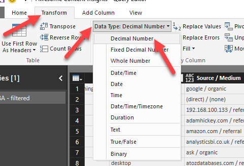
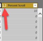
The icon next to your column will change to show you the new data type.
Make the following additional changes…no screenshots for this part. You got this!
- Event Value: Change to type Whole Number (remember, select column, Transform tab, Data Type, Whole Number)
- Total events: Change to type Whole Number
- Unique Events: Change to type Whole Number
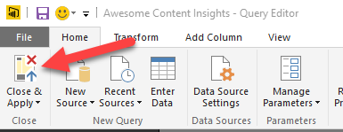
You now have to apply all the changes you just made. Still in the query editor, click the Home tab, and click Close & Apply.
With your new changes applied, make sure you’re back on the data screen.
![]()
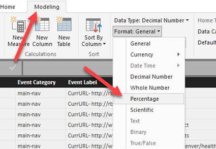
Click on the Percent Scroll column to select it. Click the Modeling tab, and change the Format to Percentage.
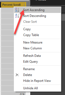
Right click on the Percent Scroll column and choose Sort Ascending. Our data is ready to visualize!
Creating our visualizations
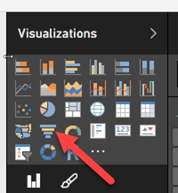
Click on the Report icon to start building your visualizations.
![]()
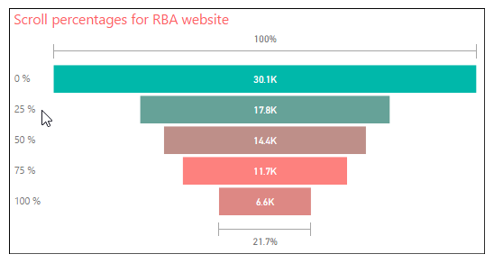
Funnel chart
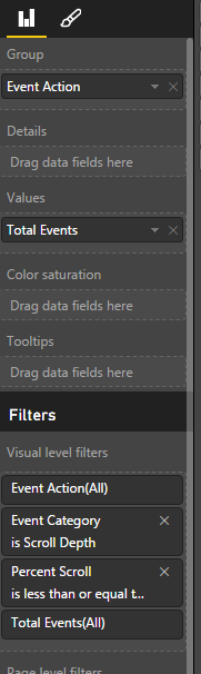
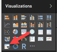
The first visual we’re going to create is a funnel chart. This will allow us to quickly see how many scrolls there are, and how many drop off between each step. To do this, find the Visualizations panel on the right, then click the funnel chart.
Next we’re going to drag the data fields we need into the funnel chart. Make sure the funnel chart remains selected. You can drag and drop the data you need from underneath the Fields panel.
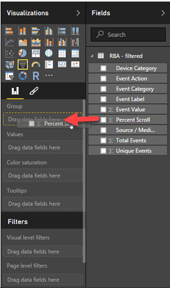
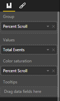
The data fields needed for the funnel chart are:
- Group: Percent Scroll
- Values: Total Events
- Color saturation: Percent Scroll
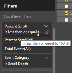
You need to apply a couple filters as well. Make sure you drag Event Category into visual level filters, then set the following:
- Percent scroll is less than or equal to 100% (Power BI might change 100% to 1, but it will have the same effect).
- Event category is Scroll Depth
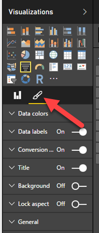
Feel free to play around with the formatting of your chart using the paint brush icon under Visualizations. I’m not going to cover it in this tutorial, but Power BI gives you a decent amount of control over how your visualizations look. You can also override the chart title and other labels, if you desire.
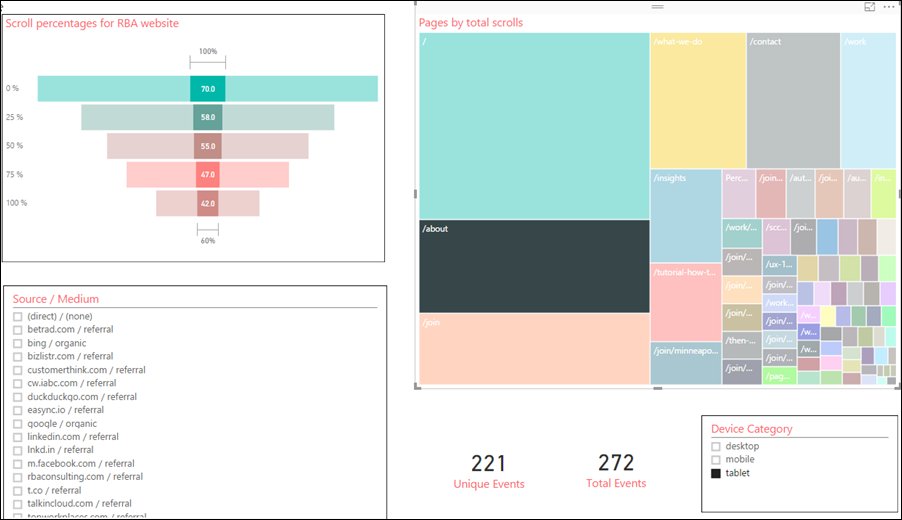
Our funnel scroll visual is now in place, showing total scrolls for all pages. Interesting, but needs additional drill-downs. So now, we need some additional visuals so we can explore our data in more depth.
Create a tree map of your website’s pages
Now we’ll create a tree map of our website’s pages.* This will allow us to explore our scroll metrics on a per-page basis. In Power BI, it’s important to note that widgets within a report generally constrain each other. For example, if I click a page on the tree map, the funnel visual will update to only show scroll metrics for that page.
*If your site has a ton of content, the tree map may be limiting. Consider a list or table for the visual instead.
To add the tree map, click the corresponding icon.
![]()
Add the following fields:
- Group: Event Action
- Values: Total Events
Filters:
- Percent Scroll is less than or equal to 100%
- Event Category is Scroll Depth
And voila! A tree map of your site’s pages. The size of the square is determined by the total number of scroll interactions on that page.
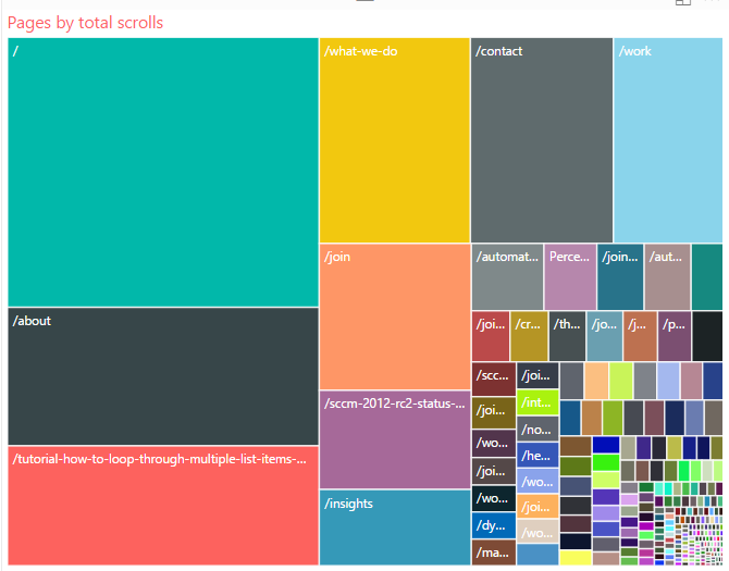
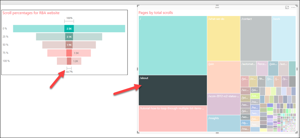
Now this is where things start to get interesting. If you click a page on the tree map, the funnel visual will show the scroll metrics for only the selected page. This is where you can start to explore your scroll data on a page-by-page basis.
Create a device slicer
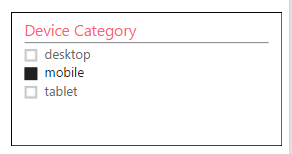
This next visual will allow you to slice your report by device type. Click the slicer icon from the Visualizations panel.
Drag the field Device Type. This visual has only one configurable option, so that’s it. You can now constrain your report by device type.
Create a source / medium slicer.
Create a slicer for source/medium. This is going to allow us to filter our report by traffic source. Create another slicer, except this time drag the Source / medium data field into it. No screenshot for this one…I think you get the idea. 🙂 My final report looks like this…I added a couple additional counters to the page as well.
Wrapping up
This tutorial gives us a very good start with our scroll insights. We can see what pages, device types, and traffic sources are garnering content engagement – and which are under-performing. It’s only a start though. We need to add additional data points to the report. For example, we need a dimension of duration. The scroll tracker script already provides a mechanism to measure the time (in milliseconds) between scroll points. We just need to configure Google Tag Manager to send these values to Google Analytics in a useful way. In a subsequent blog post, I may provide an update to this post on how to get duration into the mix. Without duration, we can’t know if someone scrolled to 100% in a very short time. In that case, even though they reached 100%, they probably didn’t read anything. So we can’t always interpret a 100% scroll as “good” without knowing the duration between scrolls.
In our case, our tablet readers tended to be the most likely to scroll to 100%, and Google organic search produced better-than-average scroll rates.
We should also combine some kind of conversion data with this report. Additional questions we should try to answer:
- Do our deep scrollers take any desired actions, or are they more likely to convert than the shallow readers?
- Can we identify pages/topics that produce deep engagement, and repeat those results?
- Do certain pages resonate more with mobile users?
- On pages with crummy scroll rates, can we identify content or usability problems that we need to fix?
- How far do users make it scrolling on the home page? Do we need to shuffle some important content around to get it into where most users will see it?
Recommended next steps
We’ve only scratched the surface of Power BI’s capabilities. I’d suggest the following as next steps:
- Get a free Microsoft account (a Microsoft Live email account works) and publish your report to Power BI online. In Power BI Desktop, simply go to File > Publish > Publish to Power BI. You have to sign in with a Microsoft account for it to work.
- Once you’ve published your report, log in to Power BI online and play around with your report. You can pin your report to a dashboard and share it with others in your organization.
- Download the Power BI app for your phone or tablet. Anything you’ve published online can be viewed on the app.
- Continue adding data points and refining your scroll tracking report.
Thanks for reading, and thanks to those of you who attended my talk at the Minneapolis Digital Summit AND read this entire tutorial. If you have any questions, comments, or constructive criticism, please let me know in the comments below.