I’m Adam Hickey, Senior Experience Designer at RBA. We do a thing at the office called “Lunch and Learn” sessions. The concept is simple: We have lunch together (free pizza always triples attendance), and we learn something. It’s a great opportunity to learn things that you may not normally encounter in your day-to-day job.

This was my month to present at the office Lunch and Learn, so I shared several UI design tricks and tips I’ve implemented over the years. And now, I’ll share them with you!
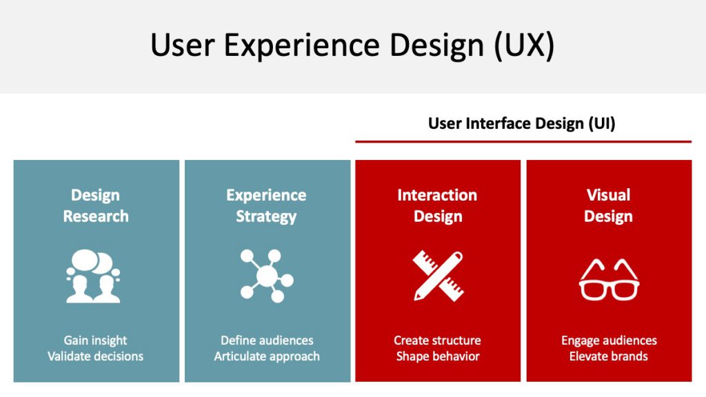
Design tip #1: UI Design is a subset of User Experience (UX) Design
To lay the groundwork for the rest of these tips, we consider UI to be part of a broader UX framework. UI design, in our definition, includes both Interaction Design and Visual Design. But UX encompasses all aspects of UI. In the future, I plan to do another session about the broader field of UX.
Design tip #2: Don’t fear the scrollbars
If there’s one thing I could get businesses to stop talking about, it would be the idea of content being above or below “the fold.” The fold is a legacy term more relevant to printed newspapers with a physical fold. If there wasn’t interesting information above the fold, the newspaper wouldn’t sell (you could only see the content “above the fold” in the newspaper rack).
Computers and phones don’t have a physical fold (or do they?), and web pages aren’t sold in newspaper racks or newsstands. So we don’t need to fear content being below “the fold.” Users will scroll down the page, as long as it is clear that additional, relevant information is below the initial viewable area.
Design tip #3: Fixed navigation vs. tabs
Fixed navigation, now a standard pattern found in CSS frameworks such as Bootstrap, is a nice alternative to using tabs. Fixed navigation allows the user to simply scroll to see all the available content.
Design tip #4: In forms, know when to use radio buttons, checkboxes, and dropdowns
Surprisingly, we still see a lot of forms that have radio buttons where checkboxes should be, or vice versa. In case there’s any confusion, here’s how and when you should use these elements:
- Radio buttons should be used when there’s a range of options, and only one option can be chosen (select one).
- Checkboxes should be used when there are multiple options, and more than one option can be selected.
- Dropdowns should be used when there are more than six options to choose from (for example, a state or region picker)

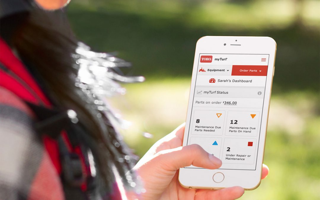
Design tip #5: Optimize for mobile (duh)
While it’s not exactly rocket science that you should optimize your website for mobile users in 2019, it’s surprising how many sites still get this wrong.
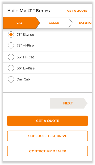
One of the most important things you can do is ensure that all tappable elements are at least 44×44 pixels. Remember, a finger is way less precise than a mouse cursor. In the example I designed below, the tappable radio buttons are large enough for a finger to select with ease:
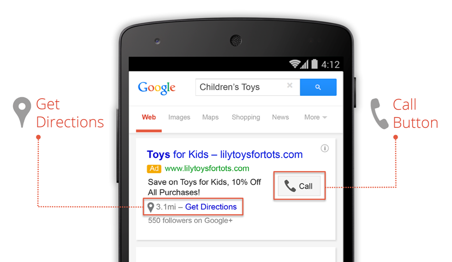
Another thing you can do is optimize your key actions for mobile users. Mobile users are often on the go, and need access to relevant information quickly. Such information often includes: Location, events, phone numbers, emergency info, and time-sensitive information. Google does an excellent job of this in their mobile Search Engine Results Pages (SERPs):
My final mobile tip is to avoid using dots on carousels to show that there are additional tiles off-screen. Dots on carousels are difficult to see and interact with on mobile devices. Instead, use images peeking from the right and left to show that there is more content available. A swipe action to reveal additional tiles is a natural, intuitive action on mobile.

Design tip #6: Be accessible to your users by applying an appropriate contrast ratio
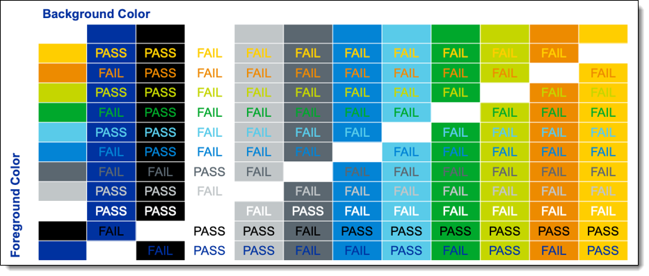
According to the Web Content & Accessibility Guidelines (WCAG) 2.1, for Level AA compliance, a minimum contrast ratio of at least 4.5:1 for regular text and 3:1 for large text is required. You can check if your website’s contrast scores by using Webaim’s free contrast checker. Here’s an example from a site I worked on that shows different background and foreground color combinations, and whether they would pass WCAG 2.1 Level AA contrast requirements:
Wrap-up
I hope you’ve enjoyed this lunch and learn topic. Sorry you couldn’t eat the free pizza. To recap, remember these simple design tips:
- UI is considered a subset of UX
- Forsake not the scrollbars (they are your friend)
- Use fixed navigation vs. tabs
- Use form elements appropriately
- Optimize for mobile
These tips and tricks have improved my designs, and I hope that by sharing them they’ll improve your designs, too. If you have any questions, please leave a comment below, or hit us up at [email protected].