

During our discussions with many customers about deploying self-service BI tools such as Power BI, one of the common dilemmas is: when do I deploy the tool to users? I don’t want to deploy the tool until my data has been validated. While this is a very real concern – and important to consider carefully – it can often paralyze an organization. We won’t offer a silver bullet today. Releasing the power of data visualization to your organization is an art more than a science. However, it’s important to consider another side of the equation: how can releasing a data visualization tool to your users help expedite the data validation process?
Data visualization in Power BI
We’ve found that releasing a visualization tool to the right subset of users can greatly expedite and facilitate the validation process. It can also be a great way to train your users on visualization techniques.
To make this successful there are three points to emphasize: 1) communicate expectations to the group of users; 2) take advantage of different visualizations to find data anomalies; and 3) Use Power BI to document and validate your steps. If you emphasize these areas you will find great progress on data validation, you will gain more buy-in from the business on the data, and your users will be further enabled with Power BI.
The first point is to make sure you are setting the appropriate expectations with your users. One of the main reasons for cautiously deploying your visualization tool is to make sure key decisions are not made on the wrong data and maintaining confidence in the tool. To that end, it’s imperative you select the right set of users who understand their role in validating the data. They must understand the information they view is for validation purposes and not publication. It’s also important to select users who can build and/or confirm initial data requirements. This creates buy-in from the users on the data and helps build sign-off and confidence in the data.
Finding data anomalies
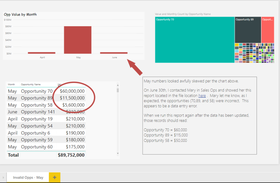
One of the reasons to use a visualization tool such as Power BI to validate data is it is a very effective way to find data anomalies. By showing users different ways to view the data, they are also learning effective ways to learn the tool. For example, a scatter plot may visualize data that is out of sync with your typical data patterns. You can also teach users how to drill into more detail to find out why data anomalies exist. Then you can teach them to view the raw data at a transaction level. All of these functions help visualize and validate the data while teaching your users new techniques with the visualization tool.
Power BI can also be a very effective way to document your validation steps. You can save your report that shows data that needs to be fixed. Once it’s fixed you can run that same report again to validate the fix is complete. Power BI allows you to add notes to your visualizations or highlight data anomalies. You can also save those reports to document the steps you’ve taken.
So, set the right expectations, and then allow certain users to dive into the visualizations. It will help accelerate the data validation process, gain buy-in from your users, and initiative the training process!
Contact us
Whether you need short-term assistance to augment your existing team, or you’re looking for a long-term Sitecore partner, let’s talk.